

Nest Run Club
A student run club that stopped trying to separate itself from its own campus.
1Plan
Before anything gets drawn: the goals, the feeling, and who the brand is for.
A logo request that turned into rebuilding the whole identity
Nest Run Club came to us for a new logo. What they actually needed was everything that sits around a logo, because the one they had was carrying the entire brand by itself and could not hold it. The club has been running since 2024, built and operated entirely by student volunteers, with nobody drawing a paycheck for any of it. They found us through a referral and asked for a redraw of the logo.
The old logo was a feather, and the idea behind it was fine. The execution was working against them: it sat off balance, the shapes were sharp and slender enough that they lost definition at small sizes, and a metallic effect on top of that made it genuinely hard to tell what you were looking at. There was no website, no color system, no typography, and no rules for how any of it should be used.
Nothing about the club was failing. They were growing by word of mouth, with members bringing friends, and that was working. The gap was recognition: there was nothing sustainable to build on top of, which is a slower and quieter problem than a business losing money, and it's the kind that only gets more expensive to fix later.
Who the brand is for
Nest isn't selling anything. They're recruiting members, and the member is a college student who wants to be active and, more than that, wants to be around other people who are also trying. The running is the reason to show up. The community is the reason to come back.
Athens is a crowded place to be a run club: there are plenty of them, several use conceptually similar marks, and standing out matters more here than it would almost anywhere else.
The question that changed the project
Early on we asked what the brand was actually for. Was the goal to attract more people, or was the goal credibility? The answer was credibility, and that reshaped everything after it. We weren't solving for reach. We were solving for prominence, which meant the work needed to make an entirely student-run operation look like something that had been built on purpose and would still be there next year.
Everything Nest does is homegrown: volunteers, in house, no budget. That deserved to show up in the brand as warmth rather than as roughness.
The disagreement
Nest believed they needed to break away from the University of Georgia's visual identity to have an identity of their own. It's a reasonable instinct, and we told them we thought it was the wrong call.
A run club isn't a business competing with the school for attention. It's a piece of the school, made up of its students, meeting on its campus. Building a visual identity that pushed away from the university would have read to students as something outside their world rather than part of it. Our recommendation was to use the school's heritage instead of fighting it, and after some real hesitation on their side, that's the direction we took.
2Brand foundations
The building blocks for the rest of the brand.
Color
The palette is red, black, and white, taken directly from the university: that choice is the disagreement above, resolved and made visible.
Typography & voice
Typography is a clean sans serif with some aggression to it, chosen for the intensity that comes with athletes rather than the softness that comes with most community branding.
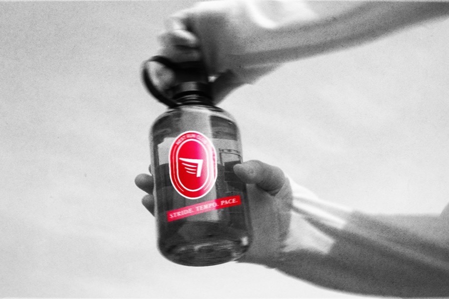
The messaging works as a mantra rather than encouragement: Stride. Pace. Tempo. The words are about cadence and about balance, the thing a runner is negotiating in their head at mile four. We deliberately steered away from the keep running and just keep going territory, because nobody repeats that to themselves. It has to be something you can actually say in your head while your legs hurt.
Imagery
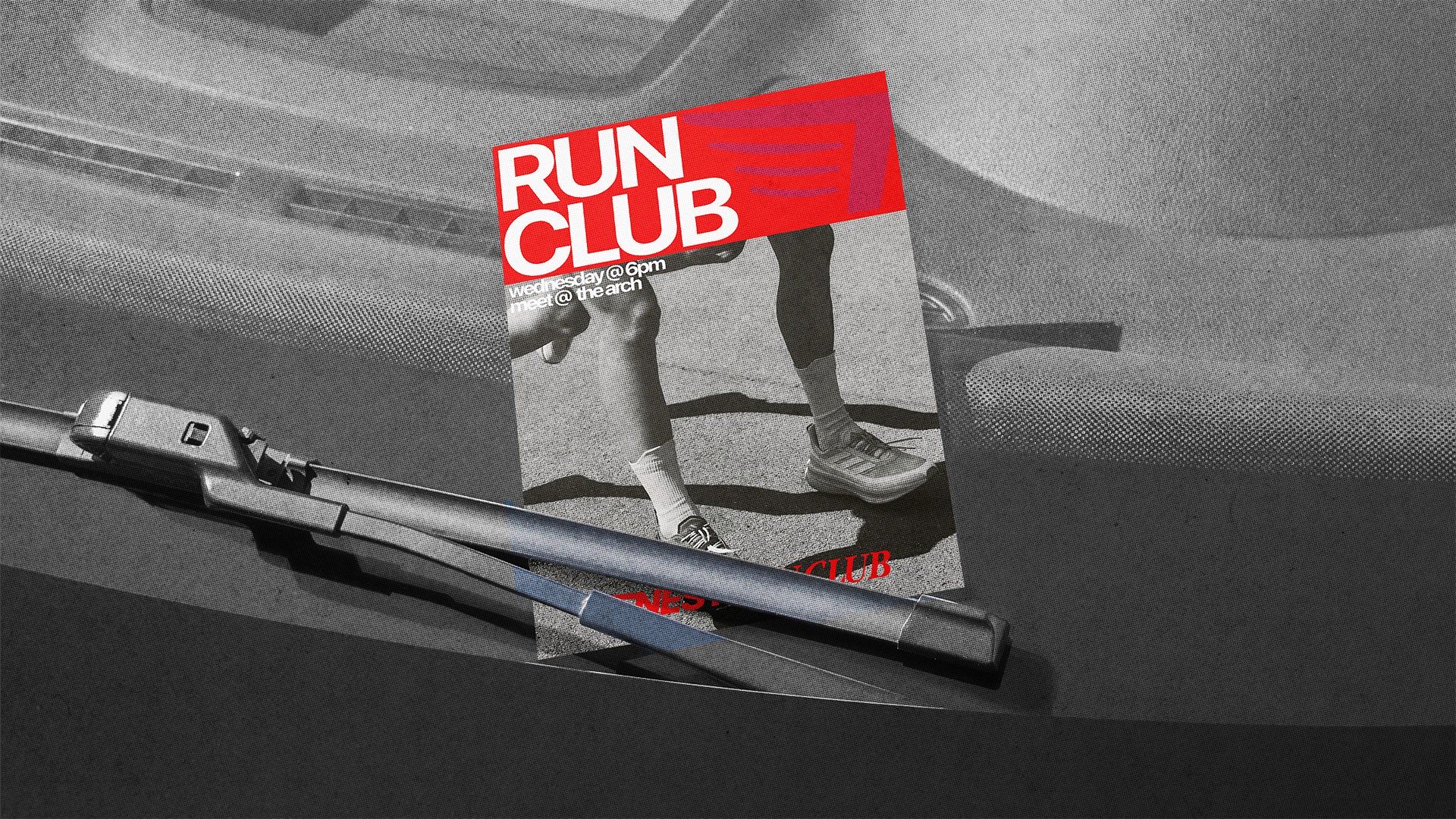
The photography direction is track fields, heavy grain, and motion blur, kept in black and white or red. Those are the brand colors, and they're also what a track actually looks like.
3Logo
What we built
We rebuilt the original concept rather than replacing it. Our first attempt was a repair of the existing mark, and it didn't work, because the structural problems were too far down.
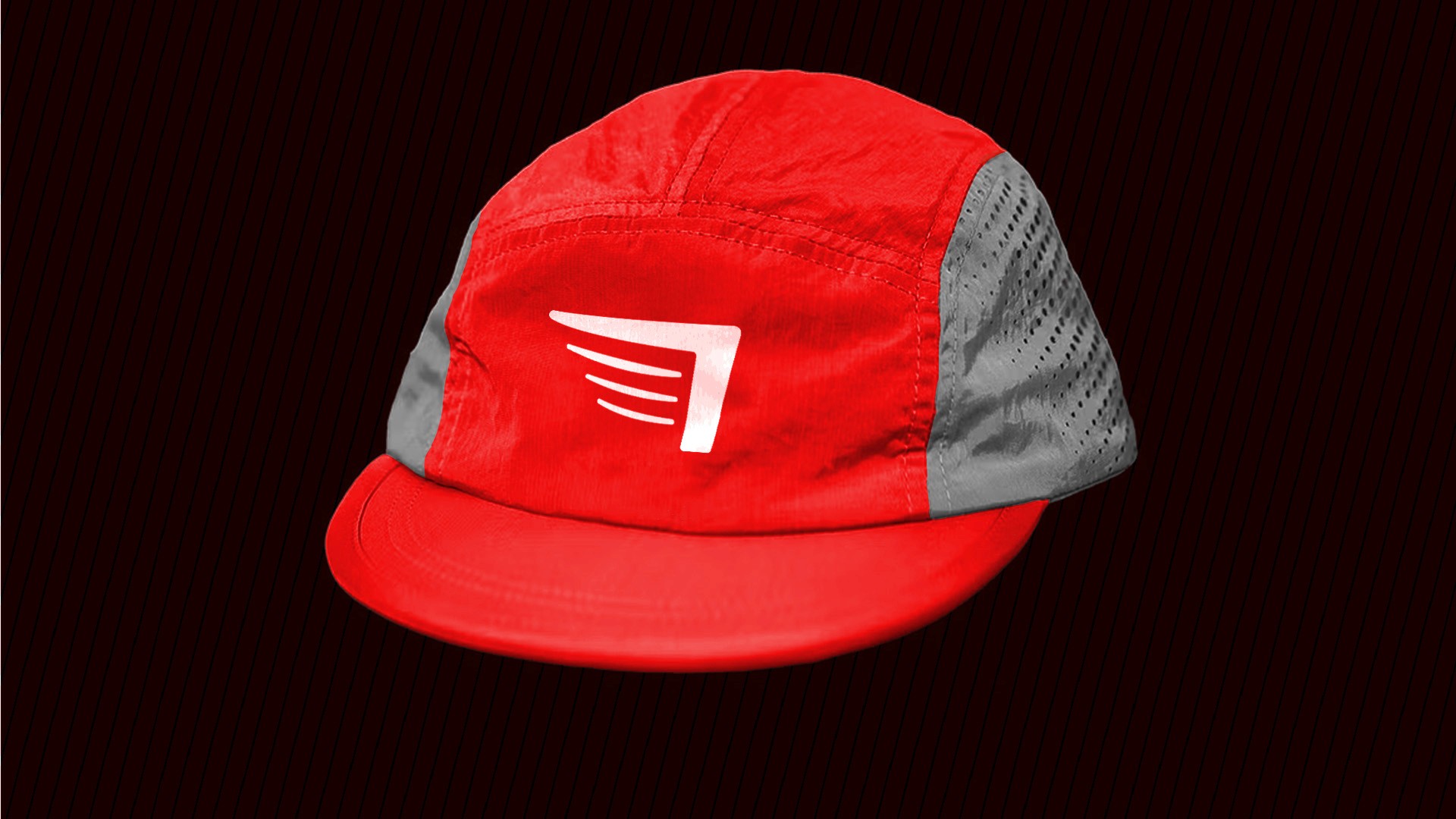
The mark that came out of that is a wing with an inward slant, drawn with enough motion in it that it always reads as moving forward.

4Additional assets
The pieces that let the club show up the same way everywhere.
5Brand in action
The full brand, in use.
Closing thoughts
How it ran, what came out of it, and what we would ask about your business too.
How it ran
Discovery, concepts, revisions, and delivery. The hardest stretch was color, which went through more iterations than anything else. The logo revisions were refinement rather than rebuilds once the structure underneath it was right.
One of the more recognized clubs on campus
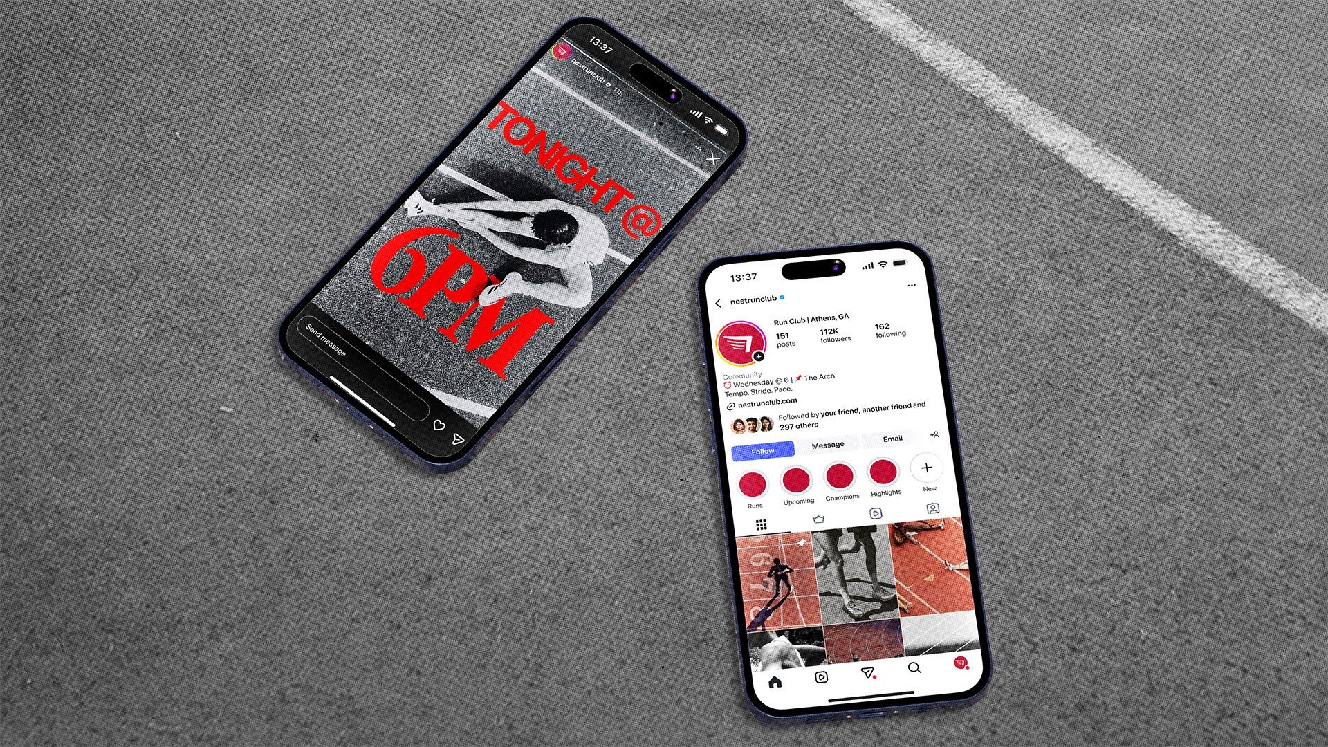
With a full set of assets and a consistent visual identity, the club can show up the same way every time it posts, prints a shirt, or turns up at an event, which is most of what recognition is made of.
What we deliberately did not do
We didn't chase trends. The old logo had been shaped by whatever looked current at the time it was made, and that's why it aged into a problem within two years. The goal was a brand confident enough in what it already is that it doesn't need to be redrawn every season to keep working.
Building a brand for a community, not against one
If Nest had separated itself from the university, the message would have been mixed and it would have landed flat with the exact students it needed, because it wouldn't have felt like theirs. The brand has to reflect the community it belongs to instead of standing apart from it, and that's the question we'd ask about your community too, before we drew anything.
One designer works every project start to finish, from the first sketch to the file you actually use. Price is how we make sure it's a fit before anything gets signed, not a rate card.
“We like taking a concept that isn't working and finding out whether it deserves to be rebuilt or replaced. Nest deserved to be rebuilt. The instinct behind that feather was right the whole time, and what it needed was structure underneath it rather than a new idea on top of it.”
Way Out Custom Branding, on this project.
Tuning Fork Solutions
Coaching
Branding a community?
If you want help figuring out whether your brand should reflect the community it belongs to, feel free to reach out.
Start the conversation