

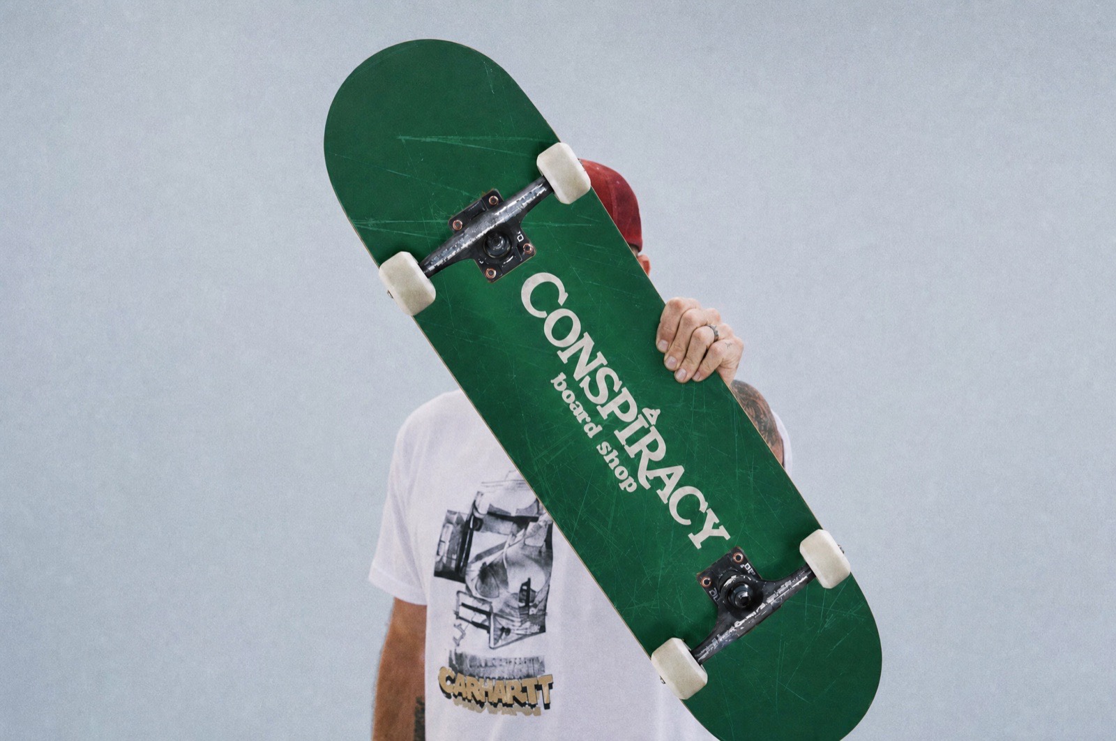
1Plan
Before anything gets drawn: the goals, the feeling, and who the brand is for.
A name, a launch date, and no brand at all
A mutual friend put Brendan and Way Out in touch. Brendan had a marketing background of his own and was moving into the skate scene, so he already understood what a brand was worth, and knew he wanted someone else to build it. When we started there was no logo, no colors, no website, and no customers, because the shop hadn't opened yet. What he had was a name and a direction, and the direction was conspiracies.
That's a different starting point than most of our work. Usually we're fixing something that's been sitting untouched for a decade. Here nothing was broken and nothing existed yet, which sounds like the easier version and is actually the harder one, because there's no wrong answer to push against.
The question that shaped everything
A brand that lives on business cards and flyers gets designed one way. A brand that lives on hoodies, hats, deck graphics, Instagram, and eventually banners and flags at an event gets designed completely differently. Brendan's answer was apparel and social, and every decision after that followed from it.
The bet: living in the early 1970s
Brendan got his start in the '70s and '80s in snowboarding and other extreme sports, so the nostalgia is genuinely his. Conspiracy sells to teens through their twenties, people carrying real anxiety about the modern world and drawn to almost anything that predates it. The '70s does two jobs at once: honest to the person who owns the shop, and a place his customers already want to go.
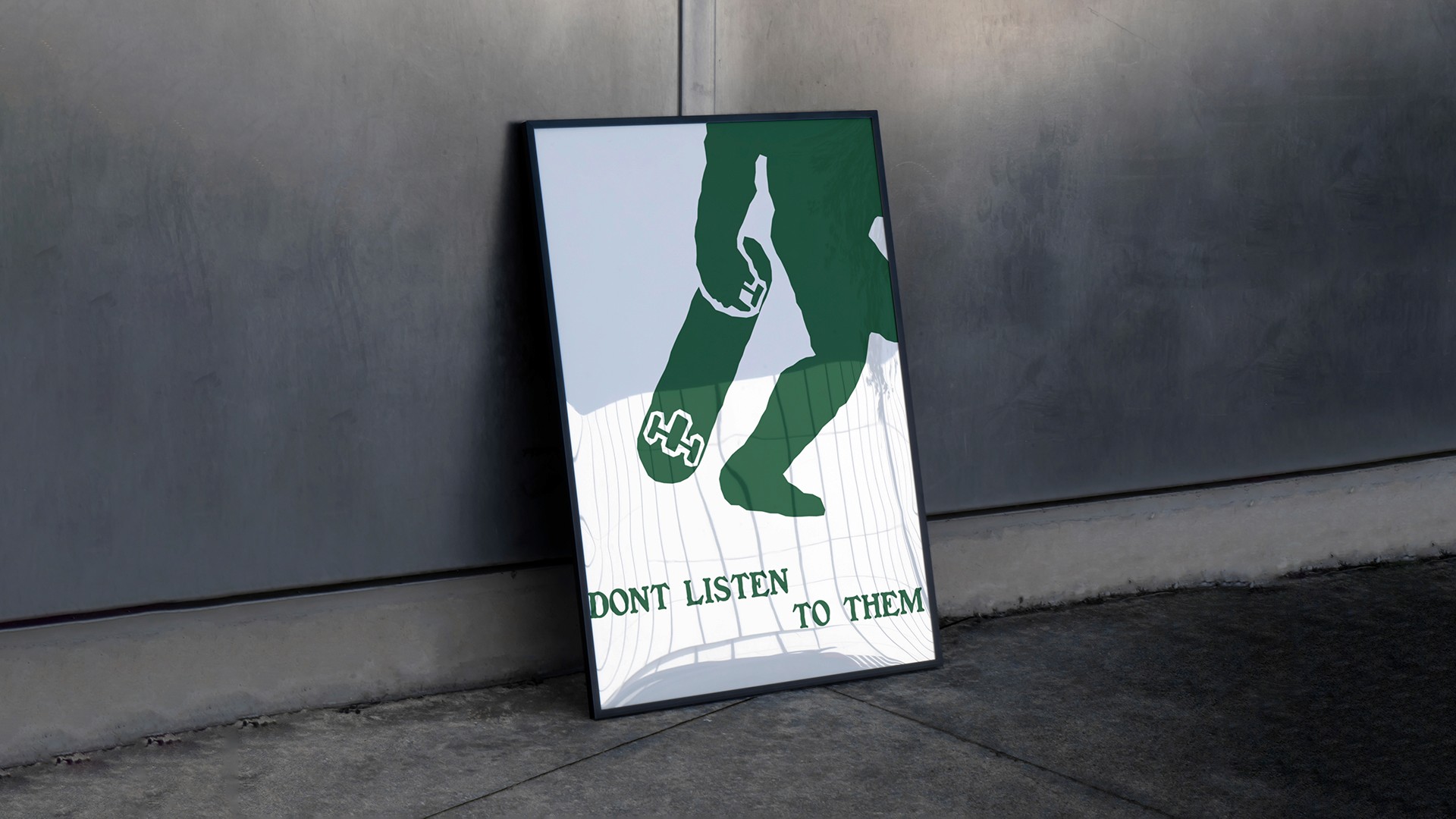
The tagline is don't listen to em': rebellion against authority on the surface, an invitation to question what you're told underneath.
What we decided not to do
We ruled out the skateboard, the wheel, the griptape silhouette, and every other shape a skate shop has already used. Brendan wasn't going to stand out by looking like a slightly different version of the last shop. We also ruled out the literal version of the concept. The first pass went straight at aliens, UFOs, and Bigfoot, and once Brendan saw them we both agreed it was too on the nose. The idea needed to be built into the mark, not printed across it.
2Brand foundations
The building blocks for the rest of the brand.
Color
Green is the primary, supported by a gold, a navy, and two light neutrals, pulled from real brand guides of businesses actually operating in the '70s rather than what people assume that era looked like now. The full palette calls back to the dollar, Bigfoot, and classic monster movies. Green earns the lead position twice over: Bigfoot territory and nature, and the color the eye is printed in on the back of a dollar bill.
Typography & voice
The display face is Benjamin Franklin, a distressed serif that feels classic underneath and looks like it's been through something on the surface, used uppercase-only for the wordmark and large headings. Body copy pairs it with Arial: Arial Black for headings, Arial in lowercase only wherever it sits next to Benjamin Franklin, so the two never compete for the same register.
Imagery
There were no existing photos to work with, so the visual direction was built from nothing alongside the identity: grungy, in keeping with the era, leaning on movement and action rather than clean product shots. The written voice stays calm and down to earth. Conspiracy questions authority without yelling about it, a harder tone to hold than the loud version, and a much easier one to keep believing over time.
3Logo
The mark
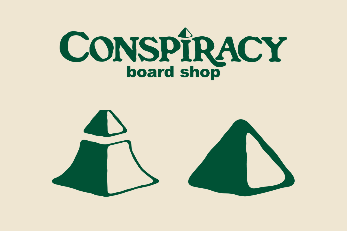
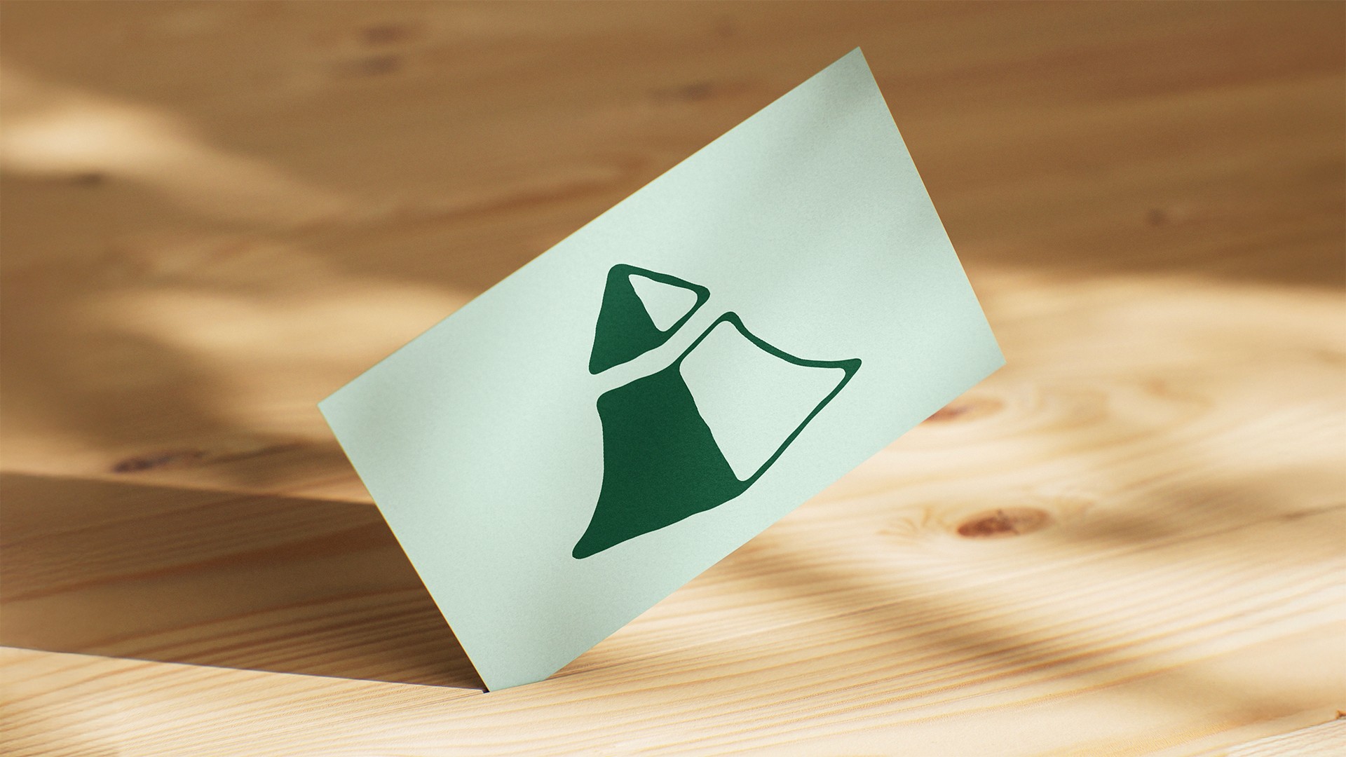
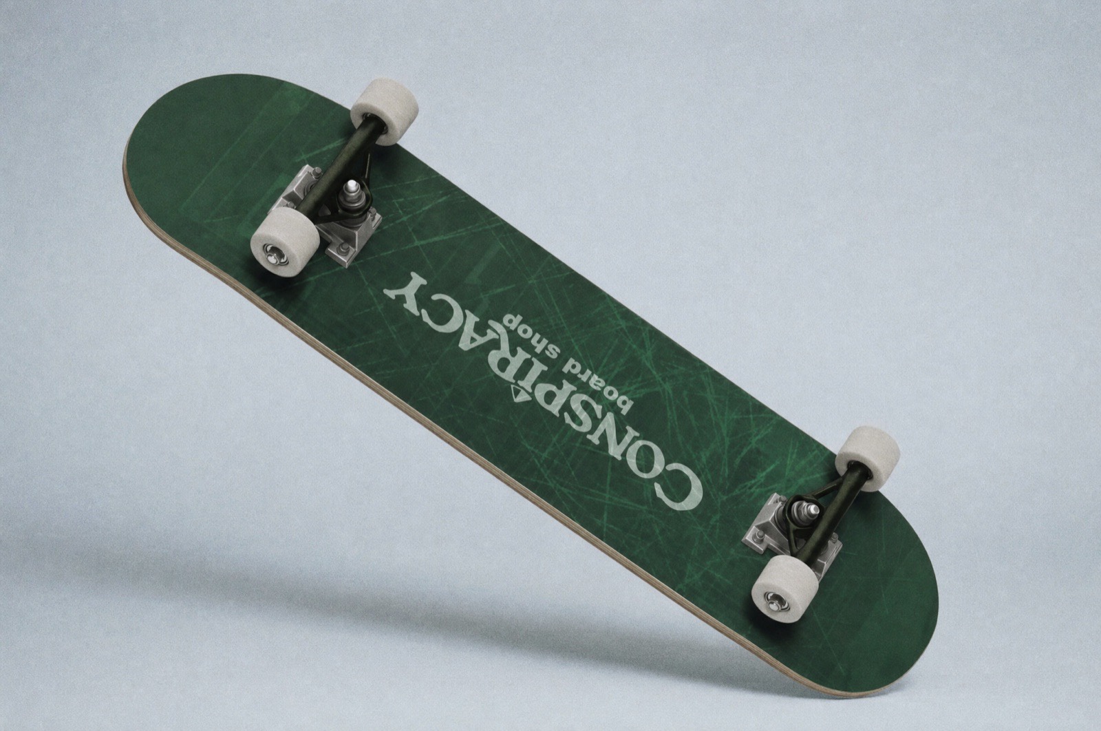
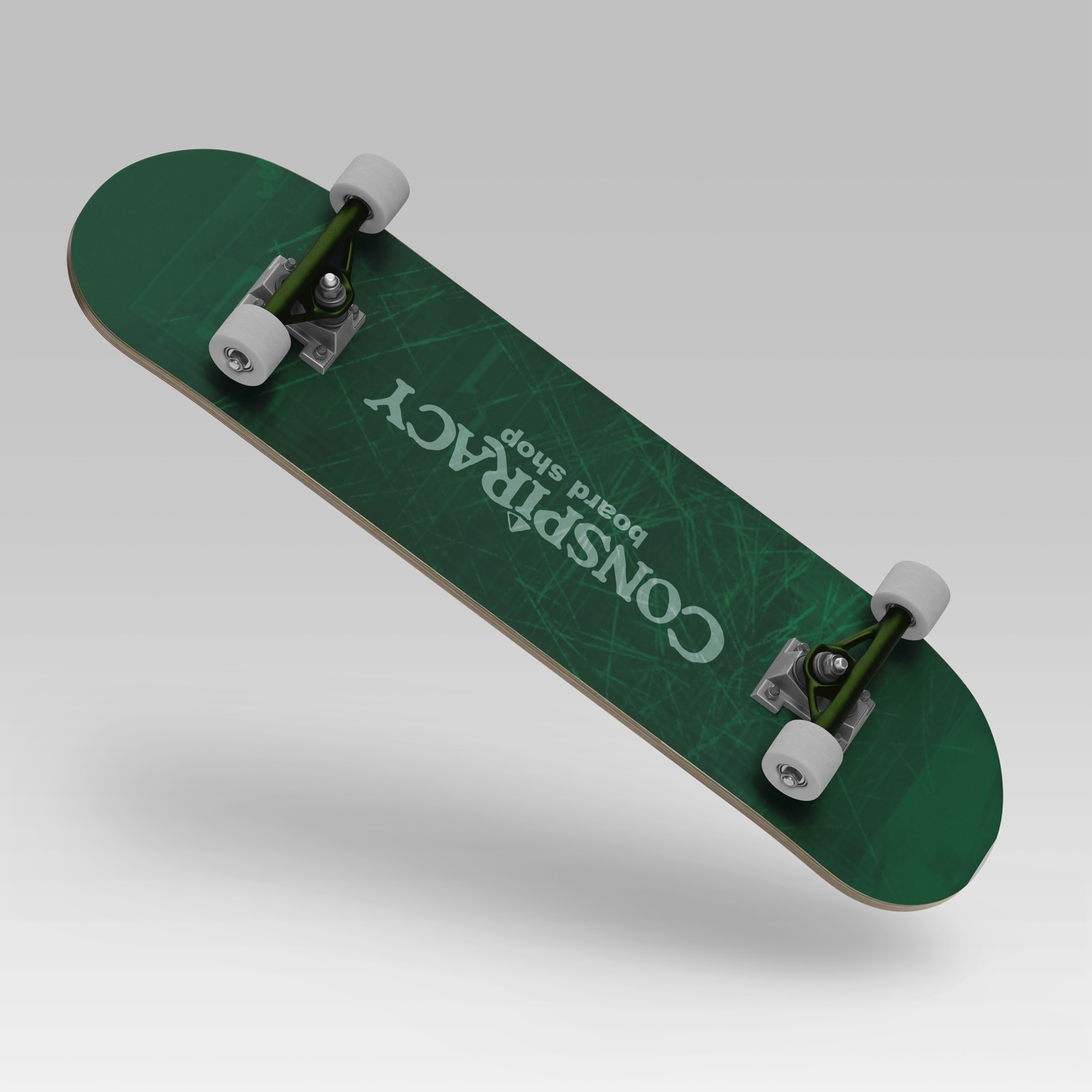
The logo is an abstracted quarter pipe that reads at the same time as the Illuminati eye. It puts skating and conspiracy into one shape instead of asking a viewer to hold two separate ideas, and it breaks down cleanly into variations and secondary marks for apparel, stickers, and social.
We built the mark as a four-tier system from the start. One logo that only worked in one lockup would've become a problem the first time someone wanted it embroidered on a hat or blown up on a banner.
4Additional assets
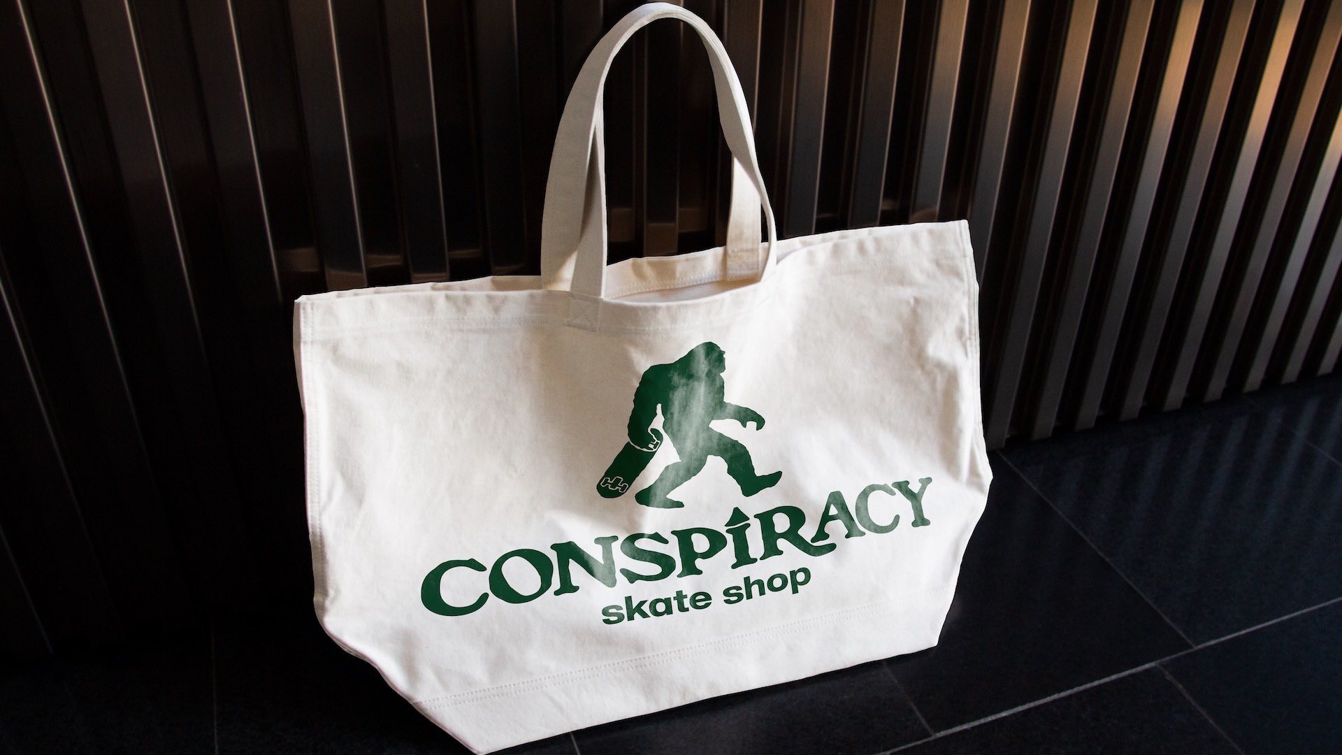
Launch graphics and merch, so the shop could sell and show up without coming back for every piece.
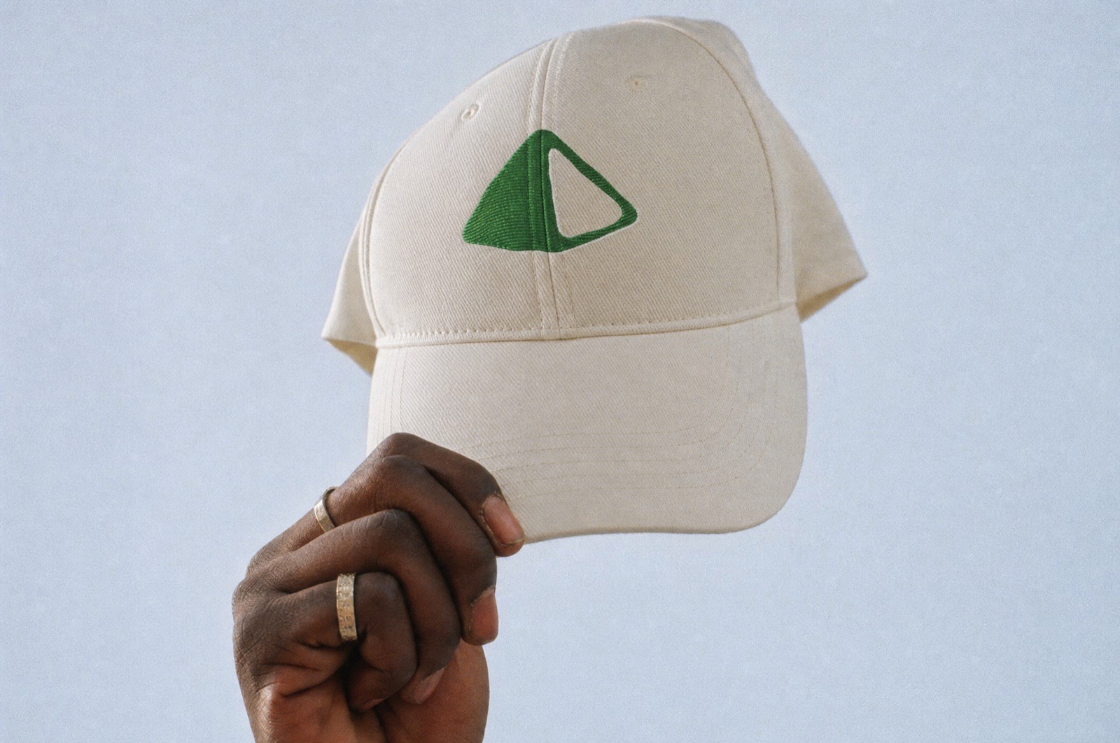
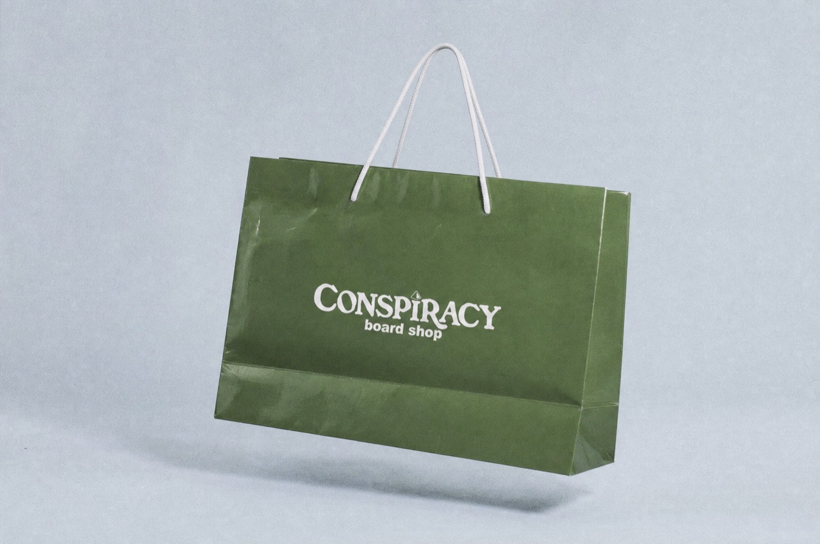
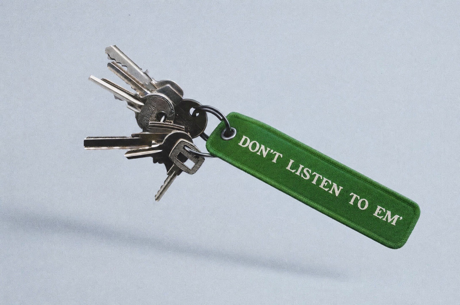
5Brand in action
The full brand, in use.
Closing thoughts
How it ran, what came out of it, and what we would ask about your business too.
How it ran
Month 1. Discovery, first concepts, revisions, and final delivery. The only hard constraint was the launch date, and Way Out finished ahead of it.
The hard part. Balance. Too much homage to the '70s and the brand becomes a costume a seventeen-year-old has no interest in wearing. Too far modern and the whole concept falls apart. Most of the revision time went into finding the middle, and it held.
Open since November 1, 2024, still going
Along with the identity, Way Out handed off launch graphics and merch designs, so Brendan could sell branded product in the shop and put something on people at events without coming back for every piece. The shop now sponsors events across the local skate scene, exactly the scenario the flexible mark was built for in the first place.
Built before the doors open, not after
Almost everyone in a crowded space is straining to stand out, and past a certain point that effort starts working against you. The brands people actually attach themselves to are the ones that feel like something familiar. That's the entire reason Conspiracy is a 1970s brand rather than a louder version of every other shop, and it's the question we'd ask about your business too, before we drew anything.
One designer works every project start to finish, from the first sketch to the file you actually use. Price is how we make sure it's a fit before anything gets signed, not a rate card.
“This is the kind of project we like most. High concept, several unrelated references braided into one idea, and a period to design toward. Conspiracy isn't a logo with a story attached after the fact. The story is what generated the shape.”
Way Out Custom Branding, on this project.
Be Social
Social Media
Launching something in a crowded space?
If you want the brand built before the doors open rather than after, feel free to reach out.
Start the conversation